“We cannot become what we want by remaining what we are.”
-Max Depree
Not everything that I paint or draw needs to be a masterpiece.
While it is only natural to want my efforts to be rewarded with a painting that I am truly thrilled with, I think that it would be foolish of me to have expectations of ‘greatness’ with every piece of art that I create. Not only would the process become mundane to me, but I feel that I would lose much of the excitement and drive that compels me to create each piece, and I think that the result would be drab, lifeless work. If that is the case, then why bother?
Many times I am asked why I jump from one medium to another. There have been times when my partner Keith has asked me, “Why don’t you work in a medium you know and are comfortable with?” This is especially true when he sees me struggling to create something using a medium that I haven’t used before. I admit that I sometimes grumble during the process, but that is only natural when things don’t always go the way we expect them to. And while I may have been know to mutter phrases like, “I should have done this in soft pastel.” or something similar, I can honestly say that I never, ever regret stepping over that line that surrounds my comfort zone and trying something new. No matter what the result, there is a huge sense of accomplishment with every new medium that I encounter. While the painting that others see may not be among my finest work, the intrinsic value of what I have learned during the process cannot be measured. It is how we learn. How we grow. How we accomplish.
This past week, I was sitting down to lunch at my desk one day and I happened on a “live” YouTube video from Lindsay Weirich (The Frugal Crafter) was posting. (You can follow Lindsay’s YouTube Channel here: https://www.youtube.com/channel/UC_pR1d2QM9MlashFgTbJQlw )
I stumbled on Lindsay a few years ago on YouTube, and I instantly loved her upbeat and down-to-Earth style. Not only did she work in a variety of mediums (a girl after my own heart!) but she also presented them in a delightful and entertaining way that kept things fun and fresh. After several months of watching her videos, I decided to join her Critique Club, where she posts club-only instructional videos using a variety of mediums and you are allowed to submit two pieces per month for her critique – all at a very minimal cost. It always helps to have another pair of objective eyes look at your work. While friends and family can be helpful, they are sometimes either ‘polite’ or not as objective as we would want. With Lindsay’s vast knowledge of so many types of art materials and mediums, I find her thoughts on my work very helpful. She offers honest assessments with the goal of making us better artists, and that is a very valuable tool for us.
While Lindsay calls herself “The Frugal Crafter”, I find she has cost me a small fortune in supplies. I say that with affection, because there have been so many ‘new’ mediums that I have tried as a direct result of seeing her work with them. My most recent splurge (thanks to Lindsay) has been the beautiful set of Sennelier Oil Pastels that I received from Keith last year for my birthday. He never knows what to get me and unfortunately for him, last year right after I watched in fascination as Lindsay created a beautiful parrot using them he had asked me what I wanted for my upcoming birthday. “Why, a set of those oil pastels would be nice.”, I quipped to him as the video was ending. Little did I know it would lead to him getting me the full, glorious set. It has become one of my favorite mediums.
So back to the other day . . . (Sorry for digressing)
Lindsay’s “Live” video showed her sketching some wonderful deer that she had seen on one of her walks and took photos of. The medium she was using for her drawings were the Graphitint water-soluble tinted graphite pencils by DerWent. I loved watching her use them and it just so happened that I already have the FULL set of them in my crafting arsenal. They have been barely used, other then swatching them out to see the beautiful colors. I pulled out my tin and decided that as soon as I finished my work for the week, I would give them a go and try to do a drawing with them. It would be both fun and challenging to see how they worked.
My first order of business was to decide on a subject. Since I never painted a lion before, I thought that would be nice. I went to one of my favorite photographers, Emmanual Keller (Tombako the Jaguar on Flickr) whose photographs I had used as reference before (with his permission) for projects like my “Marthe” Caracal in Pastel and “Joya” the Cougar for a watercolor. He is by far one of the best wildlife photographers I have come to see, and he was very kind about me using his photos as reference.
I chose a photo of Louis, a beautiful male lion, and decided that is what I would do. I decided to do just his head, as I wanted to concentrate on his face and see how much details the Graphitint would allow. I used a new paper that I got by Paul Rubens which was sent to me in error that is called a 100% Cotton, 300gm/ square meter Illustration paper. It says on the label that it has ‘good water absorption and is scratch resistant. I figured I would give it a go.
I got my supplies ready and sketched my lines on the paper.

The Graphitint only comes in 24 colors. I believe that the reason for this is because the base of them is graphite and the range of tones is very limited. As you can see in the color chart, there is not real ‘yellow’, but there are a couple of shades of brown and greenish yellows. Already it was a challenge for me to choose a golden-colored animal. But I had seen other videos where the colors looked differently depending on how they were layered, so I thought I would give it a go.
I began with the eyes (of course!) and the face:
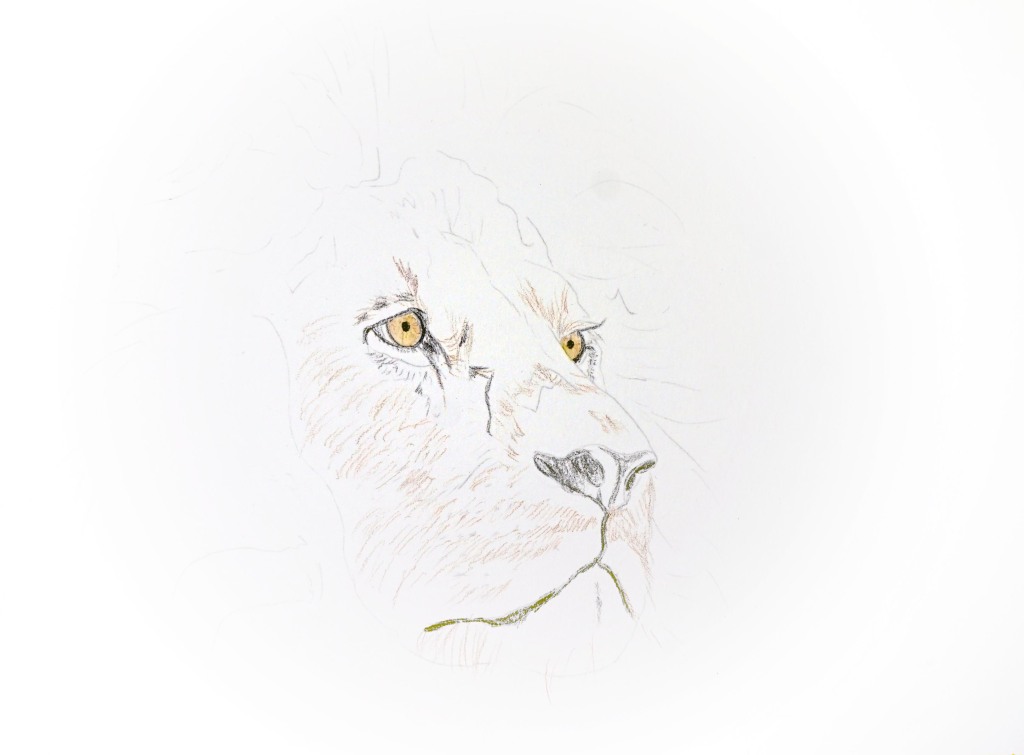

I then tried to get the base layer of the mane in place:

I’ll be honest with you all – at this point I was rather scared. The ‘Einstein’ effect of the mane looked weird to me. While I knew it wasn’t near being finished, I certainly had my doubts as to the direction it would head. I added more layers of shadings and details, little by little:

At this point, I wasn’t really happy with it at all. It looked so disconnected and ‘choppy’. I felt scared and rather discouraged (it was at this point when I found myself muttering, “I should have done him in pastel!” HA!) so I went for broke and started really adding in the color, be the result what it may be. . .

At the above point, he had ‘crazy hair’ and because of the graphite, the contrast in the mane seemed a little bit dull. I tried to wash the entire mane with water to soften the rogue hairs, but I was pulling up lots of color and was in fear of creating a muddy mess. I didn’t think the face was too bad, but the mane (especially on the left side) had a lot to be desired.
So I added more darks and black to the mix and gave it a final wash. I then added the white highlights to the eyes and adjusted some of the tones in the face and added whiskers. I discovered that the pencil erased back to a point which allowed me to reinstate some of the highlights and lighter areas. It also lifted out with a damp brush – much like watercolor paint lifts – but like watercolors, some of the colors lifted better than others.
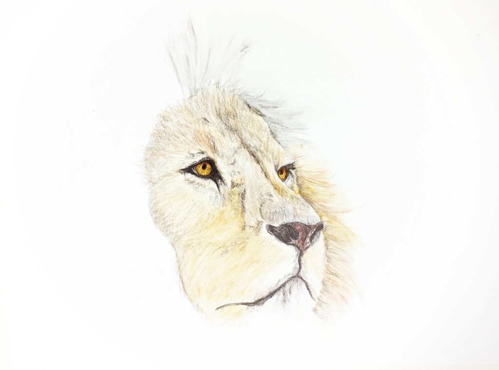
After playing around a bit more, I decided to call it ‘done’.

I am not really unhappy with the result. Especially considering that this was my first time using this medium, as well as my first lion that I think I ever painted.
Do I see areas that can be improved?
Why yes, I do. There is part of me that wants to go over that left mane again and soften things out. I also am fighting the urge to go in and lift out some highlights on that same area. And I want to reshape the left side of the face a little. I think if I tried, I could move it over and make the front of the face a little wider to better replicate the reference photo.
But I don’t think I will do any of those things. As I re-wet the mane on the last pass, I noticed that the graphite was building up a bit and I feel there is a real danger of making a mess with it. It is down pretty thick, and when wetting and moving it, it is becoming like clay and moves the entire lot of it off the paper into a muddy pile. It isn’t like watercolor in that the lower layers (for the most part) stay in place when you move the layers on top of them. I believe that this Graphitint works best when you keep things lighter and thinner. So I think it is best being left ‘as is.’
The paper did surprisingly well for something branded as “Illustrations paper”. I would have guessed that I would have run out of ‘tooth’ (grip) long before I did. While the mane on the left is definitely pushing the limits of the paper, as the pencil seems to glide over it rather than grip, it did well until now and when moving things around like the nose shape by repeatedly re-wetting and re-drawing on it, it didn’t pill or peel up even once. I was pleasantly surprised and quite impressed with it.
Overall, I am pretty happy with the entire process. I think this probably took me under six hours to draw, which for me is quite fast. While I may not put this piece in the category of my ‘best’ paintings, it is a decent one and I learned quite a lot regarding using the Graphitint pencils. I think they will be a fun and exciting medium for making artwork that may not be quite as detailed as this lion is. perhaps some autumn leaves or a sea turtle or something like that would be nice. I need to keep in mind the limitation of the muted palette, which in itself is really beautiful and soft.
I hope you liked seeing the progressions and hearing about my process. It is always fun for me to share.
Until Next Time . . .


It’s great to hear others process. It really helps to refine my own. Drawing isn’t one of my skills but I do love what others can do.
LikeLiked by 1 person
I really love sharing what I do. Good or bad – I learn from not only my own experience but reading about what others encounter, too. I hope to be learning my entire life. I think that is the best part of social media and the internet. There are so many people all over the world who love to share. I love to focus on that part of it. It makes for a positive life. Thanks for stopping by. 🙂
LikeLiked by 1 person
Oh Sheila, this came at the perfect time because I will be having my first experience with this medium on Tuesday. Thank you so much for sharing your process
LikeLiked by 1 person
Be sure to check out Lindsay’s YouTube video, Valerie. She works with it and you can see her applying it. Please let me know how you do! I would love to see your work! 😀 ❤
LikeLike
Oh, Valerie – are you taking an online course? (I meant to ask in the last comment and I was interrupted) The muted colors are really beautiful. It is kind of fun that they are so limited because they are a bit of a challenge that way. I did love working with them and I hope to do more with them. remember to let me know how you like them too. 🙂
LikeLike
He is fabulous! Love reading your blogs. You are so thourou (sp). You definitely should be a writer too❤
LikeLiked by 1 person
Thank you so much, Patricia. I love writing and have enjoyed getting back to it a bit here in my blog. I love sharing my ups and downs regarding my creative life. I have seen so many that only show their successes, but I feel I learn most from the errors I make. Experience is the best teacher, right? Thanks for stopping by.
LikeLike
Thank you for the lovely words, it is so kind of you:) the lion turned out beautifully:)
LikeLike
You did an awesome job on your lion Sheila. How can we expand our creativity if we don’t try various mediums. I love that you are not afraid to try any medium and are not afraid to share your process.👍
LikeLiked by 1 person
Hi, Anna: Thank you so much. I am beginning to learn that having my paper and supplies all “pretty” in my cabinet is not the way to be. Time to USE them and give them a go. Whether things turn out nice or not, I will always learn in the process. I used to be afraid to ‘waste’ my good paper. But I had the experience of making something really nice on crappy, practice paper and I was extremely disappointed because you could tell that the quality wasn’t there. That was more of a waste of time than if I used the good stuff and didn’t do as well as I would like. After that, I refuse to buy anything that is sub-standard or even ‘student’ grade. If you don’t use quality supplies, it makes it hard to be successful. We need to have at least a little confidence in ourselves in order to succeed. I have collected an absolute MOUNTAIN of beautiful papers for drawing, pastels, oil pastels, and watercolors. I have no excuse not to use the good paper – even when trying a new medium or technique. This paper from Paul Rubens was sent in error, and I didn’t have high hopes for it, as it is called “Illustration Paper” which is usually a general, medium-grade art paper. But I was extremely impressed with how it held up to repeated washes, lifting, and layers. A lesser-grade paper would have begun to pill or peel. So Paul Rubens gets an A+ in my book. Their supplies are usually mid-grade, inexpensive, and better-than-expected quality. This follows true to that.
Have a great week and thanks for stopping by! ❤
LikeLike
Good morning, Sheila!
Thank you for the lovely shipment of the dowel tree and accessorites…I received it around the 20th….I apologize for not informing you earlier…minor excuse, I’ve been in a boot, and will be for a couple more weeks, and although that doesn’t affect my typing fingers, it has been a bit of effort to keep up with the normal things.
The packaging was awesome. Everything was safe, and the wrapping, stickers and seals were gorgeous. I appreciate the extra care you take to deliver the treats to your customers. You defined excellence with the personalizations.
I hope you and Keith have a lovely autumn and enjoy the upcoming holiday season. It turned cool here in the mid-Atlantic just this week. Coffee on the screen porch went from mid-70’s at 6 a.m. to mid-50’s. We need to get the sweaters and boots from their seasonal storage space. I love autumn.
I’m tipping a warm Pumpkin Spice Latte to you, in appreciation. Have a great weekend.
Karen
On Sat, Sep 18, 2021 at 8:06 AM Sheila Landry Designs/Tole Painting Designs wrote:
> Sheila Landry Designs posted: ” “We cannot become what we want by > remaining what we are.”-Max Depree Not everything that I paint or draw > needs to be a masterpiece. While it is only natural to want my efforts to > be rewarded with a painting that I am truly thrilled with, I think t” >
LikeLiked by 1 person
Hi, Karen. Thank you so much for letting me know you like everything. To me, that is the most important thing. I would rather do quality than quantity and have things suffer.
I am so sorry to hear of your having to be in a boot. Hopefully, you will be able to manage the pain and find some solace in creating. You do such beautiful painting and I know that everyone looks forward to seeing what you are working on.
Please take care and stay in touch. Thanks so much for stopping by here and sending your note. I think that creativity is what helps so many of us through these unprecedented times. ((HUGS)) to you, my friend. ❤
LikeLike